What did the homeowner give you as far as initial guidance so that you could work toward the design they wanted?
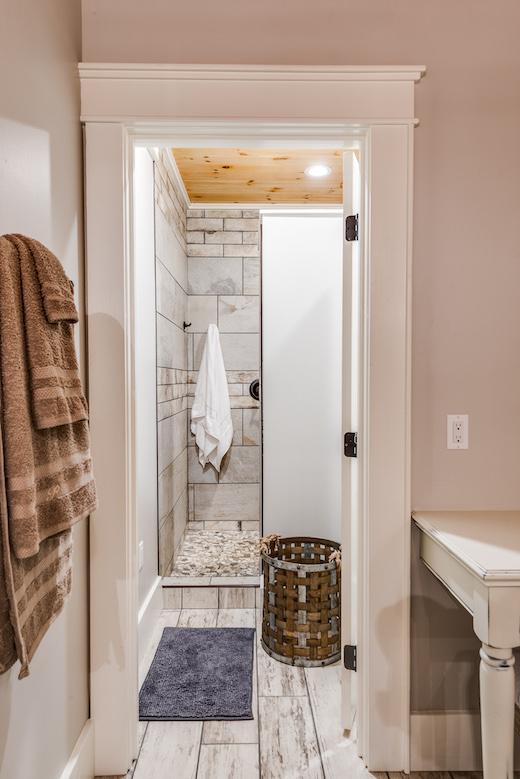
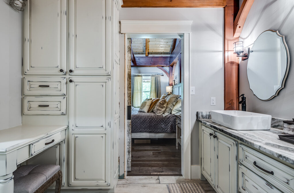
For this particular master bath, the homeowners had some “must haves” and then some “like to haves”, other than they wanted a user-friendly space where they could use it at the same time. A well-lit, double sink vanity with a separate room for the shower and toilet was a must. It was also mentioned they wanted a large built in and if possible, a makeup vanity. It was a small space but with the help of a wonderful cabinet builder we made it all happen. They also asked for the shower to have a rain shower head in addition to the two other heads located on the shower walls along with a corner stoop and nook for shampoo bottles and such.
Can you describe the layout and why you chose that layout plan?
Initially the layout was a little different and it was situated in a way that the closets were separated but still leaving for a shower and toilet room, although it was a smaller layout that it is now fished out to be. By switching both closest to the front wall of the master wing and making it one long room, there was more opportunity for space saving in the actual bathroom space and you enter the bathroom from the master bedroom and then from there you are able to either go on into the shower room or into the master closet. I chose this layout simply to lessen the number of doors and keep the bathroom area convenient to the master bedroom and useful to the homeowners.
The closet has a window and work surface, which is unusual. What was the reason for this?
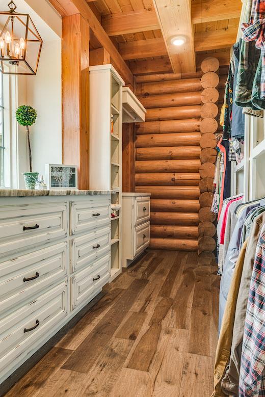
I wanted to create a space within the closet for the couple to lay their clothes out for their day or use it as a space to place things while they were putting their clothes and such away. The large work surface also made for a great place for a built-in chest of drawers for extra storage of bulky items such as hoodies or scarves for the winter months. There are tons of uses for this space and limitless opportunity for storage which was high on the couples list of wants. Another small thing about this window work surface area is that it mirrors the same look as the window area in the kitchen. Bringing that concept to the other end of the home is a neat way to bring it all together.
Explain how you balanced efficiency with privacy.
More often than not, while couples are getting ready in the mornings or when going out for date night, they both need to be in the bathroom at the same time. Separating the vanity and dressing table from the shower and toilet room is a great way to let the couple get dressed at the same time. Even the added double vanity, makes brushing your teeth at the same time as easy as walking in the room. With life being busy and on overdrive most all the time, couples need to make the most of their time, and spending less time waiting on the other by having separate spaces is a major help.
Talk about the colors and finishes in the bathroom as well as any wood, paints, stains, tile, stone, etc.
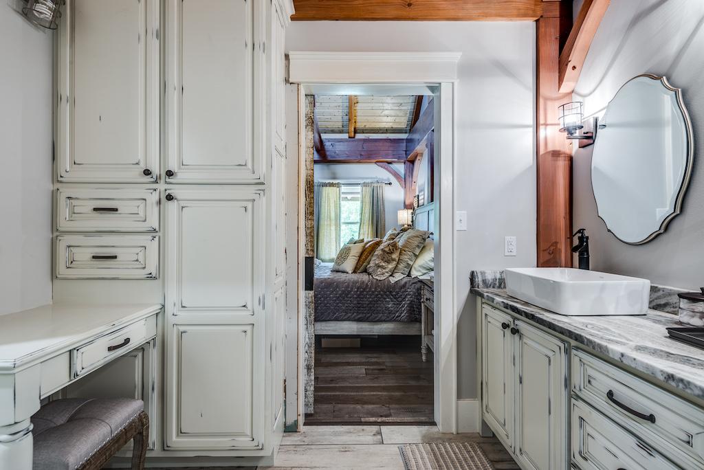
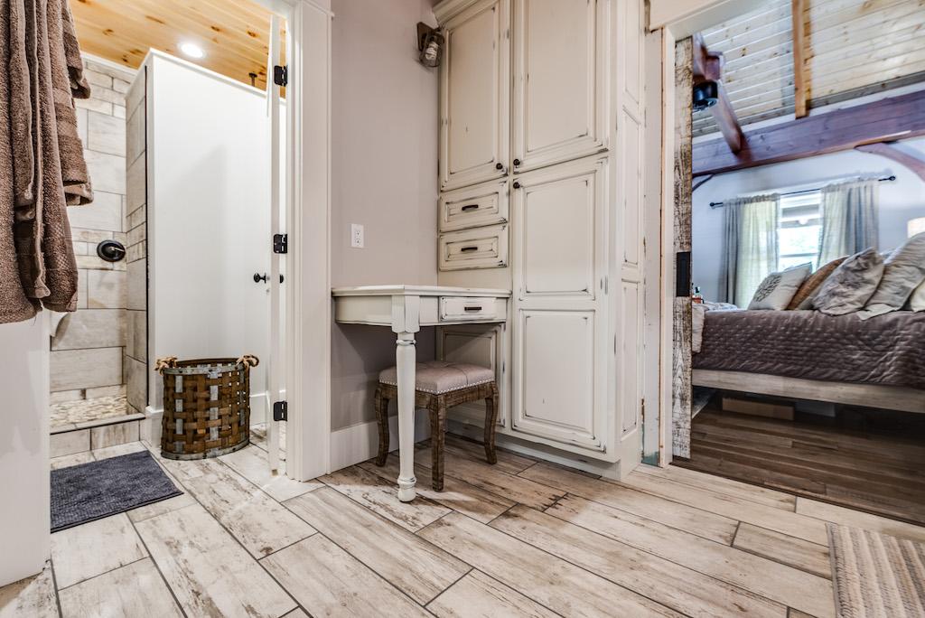
Everyone loves a clean bathroom. When selecting the colors and finishes I kept “clean” in the back of my mind. In the vanity area I chose to have the cabinets the same “white” look as the kitchen area. Antique White will brighten any space when painted out and keep the clean look going as well. The white sinks sitting on top of the leathered granite really speaks to that same look as well. While the granite has a leathered look and a bit darker too, it still has the flow of creams and whites running through out to bring the vanity together. The trim is painted out while the tongue and groove ceilings are stained in a light natural stain (by Perma-Chink) to keep the brightness going all the way up. The time floor has a wood look with a whitewashed finish and although it has that wood look, it is in fact ceramic tile. For the shower, the couple choose a stone floor and tile to compliment both the stone and the whitewashed tile floor. Keeping everything light and bright and “clean.”
What about lighting in the various areas of the bathroom. How did you decide what to use, and what was actually used?
Lighting can make or break a design. We chose to do both vanity lighting and recessed lighting in both area of the bathroom. Over the vanity you see there is one main light centered on the wall, while still having a smaller light for each mirror and sink area as well. For the shower, as you know there must be an exhaust fan, per code, we placed that over the toilet and then placed a recessed light over the shower to shed plenty of light in there because there is little to no natural light. In any design, you want to have plenty of lighting and if possible different types for different tasks, in this case, we placed ample amounts of lighting to both light up the design as well as well-lit for the tasks at hand.
